Every kit since the Championship rated
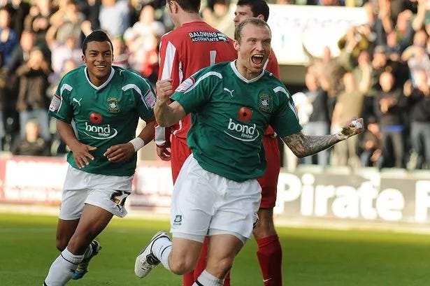
The original Bond Timber era and Reuben Reid's green panels
Welcome back to One Team in Devon, the weekly(ish) Argyle fanzine.
The new shirt is out, and it’s certainly got social media buzzing with admiration far beyond the Argyle faithful, and some immediate comparisons with the Portland Timbers.
This issue we take a look back at every shirt since we left the Championship, and give our two cents on this year’s number.
COYG.
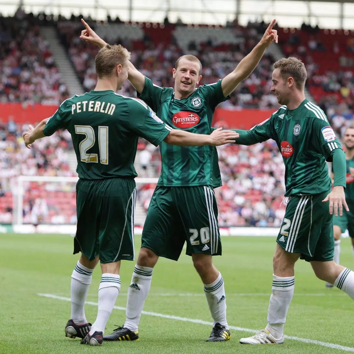
2010-11
League One
Finished: 23rd
Manufacturer: Adidas
Rating: 8/10
A belter, lost in the darkness of the financial implosion, by the time the dust settled on the 2010/11 season, this delightful green and black stripe was the last thing on anybody’s mind.
2011-12
League Two
Finished: 21st
Manufacturer: Puma
Rating: 5/10
The inaugural shirt of the Bond Timber era is synonymous with Warren Feeney and Simon Walton scrapping to keep the club in League Two, as the traditional badge was returned to the shirt after the previous regime was banished. The green isn’t right and the memories are terrible – but by god it’s better than what was to come.
2012-13
League Two
Finished: 21st
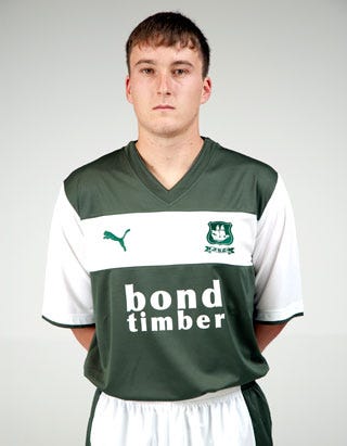
Manufacturer: Puma
Rating: 3/10
Designed in five minutes by a work experience at Puma, it’s hard to imagine less effort or investment in a kit. Bond Timber seemed to give up on its logo, which had some finesse the year before. Even the material and the v-neck scream crisis club – and Luke Young, pictured here, was clearly embarrassed to wear it.
2013-14
League Two
Finished: 10th
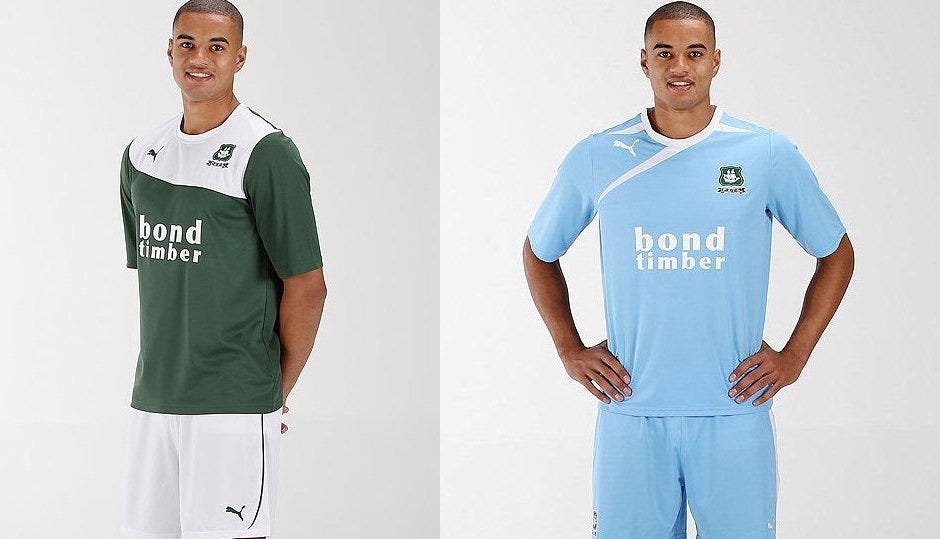
Manufacturer: Puma
Rating: 4/10
We added an extra point for the slight refinement of the neckline and pattern, but this kit kicked off a run of some absolutely shocking away shirts – with the sky blue Argyle pictured here.
2014-15
League Two
Finished: 7th (Play-off semi-final)
Manufacturer: Puma
Rating: 6/10
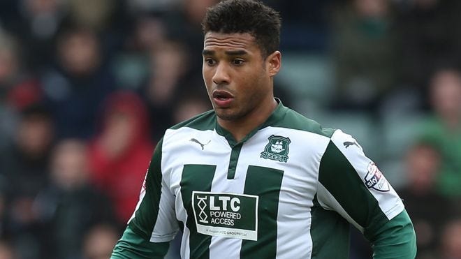
It was LTC to the rescue as Argyle turned on the style under Derek, both on the pitch and in the dressing room. Who else could show off this green and white homage to a four-panel door better than Reuben Reid, who terrorised defenses wearing this now long-forgotten strip?
2015-16
League Two
Finished: 5th
Manufacturer: Puma
Rating: 6/10
Minimal design work was undertaken by Puma for the following season, adding black shoulders and shorts.
They should have added black armbands to mourn the death of hope we’d endure at Wembley come May.
A note that this also featured the lilac away shirt, which was a disgrace. So bad, in fact, they couldn’t even be bothered to take proper pictures of it (above).
2016-17
League Two
Finished: 2nd
Manufacturer: Puma
Rating: 7/10
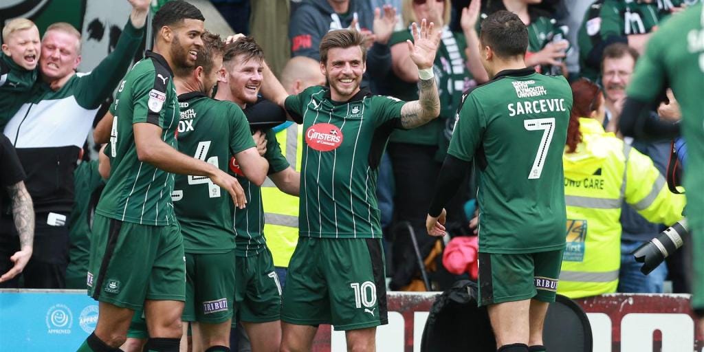
A homage to classic Argyle kits, with the perfect shade of green, a classic white stripe – and Ginsters was back in the fold with its iconic logo on the front. It duly powered Argyle back to League One.
2017-18
League One
Finished: 7th
Manufacturer: Puma
Rating: 4/10
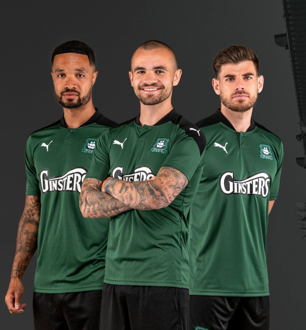
I own this shirt and was clearly high on promotion fumes as I didn’t question it at the time. It’s retrospectively awful with that textured stripe, although the quintessential Argyle green is on point. However, the lime green/black Magic Eye away shirt was such a shocker, we knocked an extra point off.
2018-19
League One
Finished: 21st
Manufacturer: Puma
Rating: 9/10
I absolutely loved this home shirt, and despise that it’s forever tainted by that awful relegation. However, that spearmint Bristol Rovers away kit can get in the bin.
2019-20
League Two
Finished: 3rd
Manufacturer: Puma
Rating: 5/10 (0/10 away)
A pretty boring home kit and another fever dream of an away kit. The pandemic may have stolen our freedoms, but it can have these shirts.
2020-21
League One
Finished: 18th
Manufacturer: Puma
Rating: 5/10
Another home shirt best remembered behind closed doors, the black third shirt was the more notable addition in 20/21. The button on this was also crap.
2021-22
League One
Finished: 7th
Manufacturer: Puma
Rating: 7/10
A greatest hits album in one Argyle shirt, surely no one can hate this one.
2022-23
League One
Finished: 1st
Manufacturer: Puma
Rating: 9/10
Probably the one time the club has done something bold and really nailed it. The Plymouth city crests make up a delightfully two-toned textured green – and the Project 35 anti-poverty cause as the front-of-shirt sponsor sticks two fingers up at the scourge of betting in football. One for the ages.
2023-24
Championship
Finished: ?
Manufacturer: Puma
Rating: 8/10
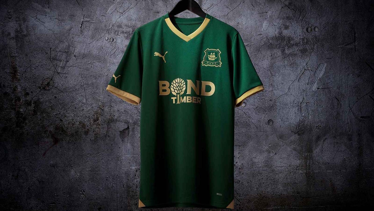
The use of gold will always divide opinion, and we have slight misgivings about the shade of green that has been adapted to complement the trim. The early pictures are stunning, although the shots from Argyle’s first pre-season games make it look a little dark. But as a statement of intent back in the Championship, this will be an iconic shirt.


